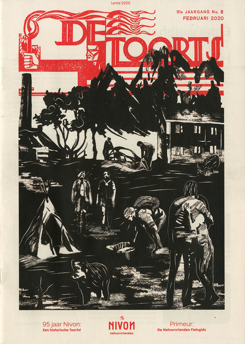
Nivon approached me to design the cover of their magazine De Toorts (The Torch). The magazine has been in existence for 95 years and has its origins in a workers’ movement. So my challenge was to make it look like it was from the 30’s.
I started collecting information about Nivon through conversations with my contact. Based on that information, I created a very accurate image archive that I could use as reference material.
I started drawing from that archive. The situations I drew I could immediately link back to activities that Nivon organizes.
It was a challenge because I had to make sure it had the feel of 1930s wood carvings. I started with pencil and after digitizing everything I printed it on old paper and added new lines. Lines that are almost identical to the lines of wood carvings.
The end result is something I’m proud of.